Visual Language Audit

USANA HEalth Sciences

Overview

This case study examines a visual language audit conducted for USANA to assess and enhance brand consistency across platforms. As USANA expands into new markets, maintaining a unified visual identity is essential. The audit focused on typography, color usage, branding, and digital assets to ensure clarity and alignment with the brand.

my role
I led the visual audit, handling research, asset collection, and analysis. I identified inconsistencies, created graphics to illustrate key findings, developed a presentation, and delivery.

Objectives & Goals

Creating a unified and recognizable visual language is essential for any brand's growth, consistency, and user experience. As part of my work with USANA, I conducted a comprehensive visual audit to assess the current state of USANA’s design system, identify inconsistencies, and develop a strategic approach to refining its visual identity. The primary objectives of this project were to:

  1. Conduct a thorough audit of USANA’s existing visual assets to identify inconsistencies and areas for improvement.
  2. Develop a strategic framework to standardize the visual language across digital and physical touchpoints.
  3. Enhance brand recognition through cohesive use of typography, color, iconography, and imagery.
  4. Improve efficiency and collaboration by establishing clear design guidelines for internal teams.
  5. Implement a governance model to maintain consistency as USANA expands into new markets.

Defining a Visual Language

A visual language is a structured system of design elements, including typography, color, shape, form, and space, that work together to communicate a brand’s identity and ensure a consistent user experience. It plays a critical role in UX design by ensuring that a product or service maintains a coherent and recognizable look and feel across all touch points.

Visual Language vs. Design System

One common question is whether a visual language and a design system are the same thing. The answer is no. While closely related, they serve different functions:

  • A Visual Language focuses on visual components and how they convey meaning
  • A Design System includes style guides, components, patterns, and documentation on how to implement them effectively.

The Visual Language is a key component within a Design System, shaping the overall aesthetic and functional coherence of a brand’s digital and physical products.

Why Invest in a Visual Language?

A strong visual language is crucial for brand success, as it serves as the foundation for consistency and recognition across all platforms. Without a well-defined visual language, inconsistencies in branding can lead to confusion among users and a fragmented brand identity. By establishing a unified system, organizations can create a seamless and professional experience that enhances customer trust and engagement. Additionally, a standardized visual approach enables design teams to work more efficiently, reducing the need for redundant decision-making and revisions. Ultimately, investing in a clear and cohesive visual language not only strengthens a brand’s presence but also improves the overall user experience.

A strong visual language offers several key benefits:

  1. Shared Vision – Ensures all teams work towards a unified brand experience, improving collaboration and efficiency.
  2. Shared Rules – Establishes design constraints that help maintain consistency and speed up the design process.
  3. Brand Recognition – Strengthens brand identity, making it more recognizable and memorable to customers.

The Audit Process

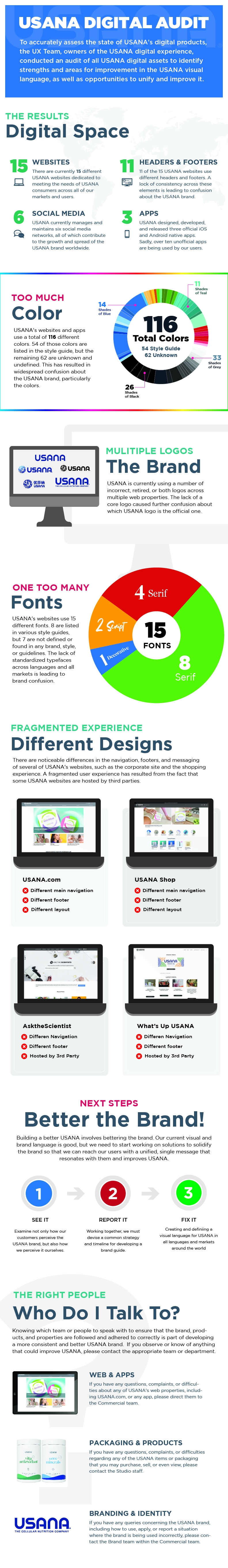
To understand the state of USANA’s visual language, I conducted an extensive audit of digital assets across multiple markets. This process involved a deep dive into various brand elements to uncover inconsistencies and identify opportunities for improvement. The audit covered multiple mediums, including:

  • Websites & Apps – Reviewed color usage, typography, branding elements, layouts, and UI components.
  • Social Media & Emails – Assessed consistency in brand representation.
  • Print Materials & Packaging – Examined how physical assets aligned with digital branding.
  • Photography & Slide Presentations – Identified inconsistencies in visual storytelling and brand adherence.

This comprehensive evaluation provided a clear picture of where inconsistencies lay, serving as the foundation for the strategic improvements outlined in the next phase

Key Findings

  1. Inconsistent Color Usage
    Across USANA’s websites, over 116 colors were identified, many of which were not part of the official style guide. Some sites used multiple shades of the same color without clear guidelines, leading to visual discrepancies.
  2. Typography Disparities
    While the brand primarily used fonts such as Gotham, Montserrat, Lato, and Ping Fang, additional unapproved fonts like Roboto, Noto, and Segoe appeared in different instances, diluting brand consistency.
  3. Logo Placement & Usage Issues
    The outdated USANA globe logo was still widely used, despite being retired. Additionally, logo placement varied significantly across digital and physical platforms, creating a lack of uniformity.
  4. Website Layout Inconsistencies
    With 15 different websites, USANA lacked a cohesive design system. This resulted in varied navigation structures, page layouts, and footer styles, which negatively impacted the user experience.
  5. App UX Variability
    While some mobile apps adhered to branding elements, others deviated, leading to an inconsistent user experience across platforms.
  6. Social Media Strengths
    USANA’s social media presence was a positive outlier, demonstrating strong branding consistency with well-maintained logo usage and visual alignment.
  7. Slide Presentations & Email Templates
    Emails followed brand guidelines relatively well, but slide presentations varied greatly in style and lacked standardization, affecting professional presentation quality.
  8. Iconography & Illustrations
    A mix of illustration and icon styles was used across platforms, making the brand appear fragmented rather than cohesive.

To make these findings more accessible and actionable, I created two slide decks and an infographic that summarized the most critical inconsistencies and provided a clear roadmap for improvement. These slide decks served as a condensed summary of the audit itself, ensuring that stakeholders could quickly understand the key issues without sifting through extensive documentation.

Additionally, I outlined how to construct and implement the visual language, detailing key principles such as typography, color schemes, iconography, and layout structures. This provided a clear framework for achieving consistency across all materials, making it easier for teams to apply standardized design elements moving forward.

Based on the audit findings, I developed a framework to establish a stronger visual language for USANA. The strategy focused on four key pillars:

1. Color Scheme Standardization

The process of defining and applying a consistent set of colors across all brand materials to maintain visual identity and recognition.

  • Maintain well-established brand colors while ensuring uniform application across all platforms.
  • Define clear guidelines on how colors should be used, including primary, secondary, and accent colors.
  • Address color variations based on cultural perceptions, ensuring global market adaptability.

2. Typography Guidelines

A structured set of rules that govern the use of fonts, sizes, spacing, and alignment to ensure a consistent and professional visual presentation.

  • Maintain core typefaces while setting clear rules for when and where to use each font.
  • Establish guidelines for font size, weight, spacing, and alignment to ensure consistency.
  • Create a hierarchy system that guides how typography is applied in different contexts.

3. Imagery & Illustration Cohesion

The practice of unifying the visual style of illustrations, icons, and photography to create a consistent and recognizable brand aesthetic.

  • Develop a distinct illustration and iconography style that aligns with the brand’s overall tone and message.
  • Establish a curated photography style, ensuring consistency in lighting, composition, and thematic elements.
  • Standardize image treatment, including color grading and filters, to maintain visual unity.

4. Comprehensive BrandGuide Development

The process of defining and applying a consistent set of colors across all brand materials to maintain visual identity and recognition.

  • Create an extensive brand style guide covering typography, color, imagery, logo usage, and layout structures.
  • Provide examples of correct and incorrect implementations to ensure clarity.
  • Establish governance and review processes to maintain consistency across teams and regions.

5. Defining a New Visual Strategy

With the audit complete and strategic recommendations in place, the next phase involves collaborating with internal teams to implement changes.

This includes:

  • Updating design systems to align with the refined visual language
  • Training teams on the new guidelines to ensure widespread adoption.
  • Conducting further user research to refine and validate improvements.
  • Monitoring consistency through periodic audits and feedback sessions.

Conclusion

Developing a strong visual language is a critical step in building brand consistency and enhancing user experience.Through this project, I demonstrated my ability to conduct a thorough designaudit, identify key areas for improvement, and develop strategic solutions toenhance brand identity. By refining USANA’s visual language, we are creating amore cohesive, recognizable, and user-friendly experience across all digitaland physical touchpoints.

This case study highlights my expertise in visual design, brand strategy, andUX/UI consistency—key skills that I bring to any design team looking toestablish or refine their brand’s visual identity.